This is hopefully my last small update before the new site is launched next week. That little cold has turned into an ugly beast. While it’s still hampering my ability to eat anything but soup, it has forced me to “be still.” Which translates to: work out all the boring technicalities in Flash that would typically make me squirm. I’ve had all the patience in the world this week, becaues I physically haven’t had the strength for anything else. Now I’m just adding final touches and I’m finally proud of my {handmade} site.
When I was in school, I was waiting on a class to finish and I just happened to overhear a professor tell a student that they should always hate their past work. It means that you are growing as an artist & have gained valuable perspective. At the moment, I didn’t quite understand because I was very proud of what I was doing. Now, well… take a look for yourself:
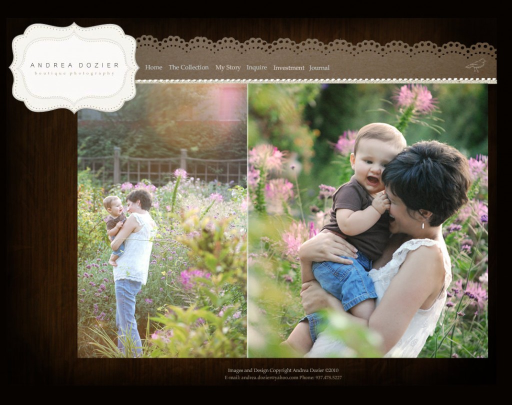
 This was my first Flash designed website. The class was very overwhelming, but I loved the program. Our final assignment was to develop a flash site for a photography business {oh the irony}. I was so happy with my ideas that I gladly shared them to my friends, family, and internet friends. Now I feel almost embarrassed to even post this screen shot!
In reflection, I do realize that part of the reason we dislike our older work is because of limitations we had at the time. Did I understand the power of PNG files like I do now? Not entirely. Did I even know how to script my own keyframes & movies so that I could put my ideas into digital format? Not a clue. I copied and pasted “practice code” from my teacher and tried to fit my designs into the template from practice files. Finally, was I still trying to cultivate my personal design aesthetic? YES. Using a feminine color palette, birds, clean space… although the Web 2.0 look is very yesterday to me. I would have handrawn the birds and definitely changed the colors if I re-did this exact site today. I would have also worked on the grid, because it’s not really working out so well. Neither is the logo, even though I can see a small bit of “good” in it.
Designing a brand is no small undertaking. Converting that brand visually into other media formats, especially a website, is very challenging. I’ve maxed out my old sketch book over this site & used up my share of micron pens trying to solve the design problems. Here is a sneak peek:
I’ve added & taken away numerous objects… only to keep most of the existing site. I was more careful & paid attention to every detail. The purpose of this site is to showcase a digital portfolio, so I tried to focus on the best way to do that. In the second screen shot, you can see where you will finally be able to have greater navigational control on the slideshows {finally} when you mouse over the bottom of the image.
Whether it’s design or photography, I always want to grow. I always want to see progress & learn new techniques. Even when I feel like the past isn’t always very admirable, I want to critique it with clarity so I can become a stronger artist.
Thanks for keeping up with me during this transition, I will let you know when it’s ready!
My new twitter bird {above} is handdrawn. I wonder where that little birdy inspiration came from…


It looks great. I can see it growing over time. You are doing a fabulous job Andrea.